A look at the thinking behind four different identity designs
Logo design often begins with a single idea that captures the character, story or purpose of a brand. Every organisation has a different personality, so the visual approach must respond to what makes each one unique. Here are four logo concepts that reflect different ways a simple idea can shape an identity.

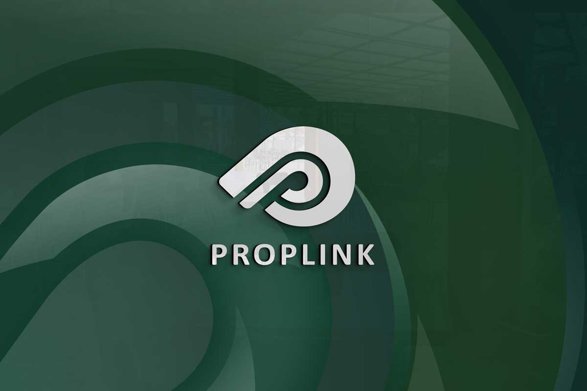
Proplink
This concept combines the shape of a whistle with the letter P to express alertness, guidance and people focused support. The overlapping lines form two P shapes, symbolising connection, partnership and the flow of information through a network. The circular motion hints at unity and continuity, while the linked forms suggest loops coming together, much like the meaning behind the word “link”. The mark captures the company’s role in supporting people and connecting communities through information and communication.
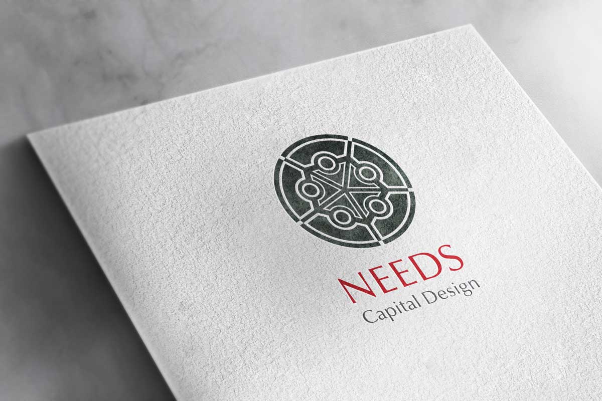
Needs Capital Design
This concept is inspired by the idea of a bridge connecting China and Japan, reflecting the company’s role in linking two financial markets. The curved form suggests a traditional Chinese bridge with a river flowing beneath, symbolising the movement of capital and opportunity. The name also carries a sound associated with wisdom, which influenced the design’s emphasis on clarity and intelligence. The logo captures the company’s belief in collective insight, presenting an identity rooted in cultural beauty, strategic thinking and the strength of people working together.


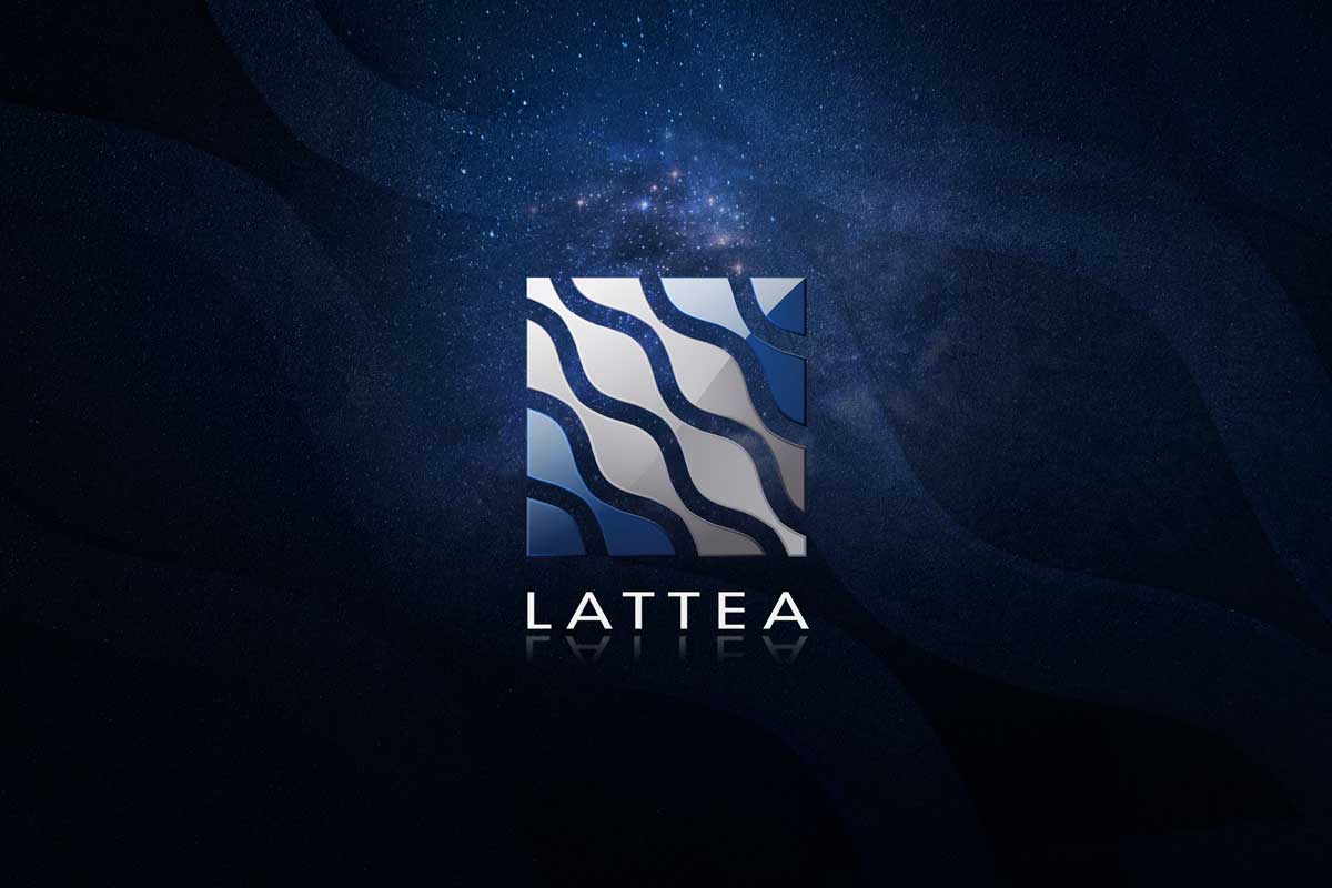
Lattea
This concept draws from the Italian term for the Milky Way, reflecting the brand’s connection to style, movement and universality. The flowing shapes suggest the currents of the galaxy, expressing the idea that all elements coexist in harmony. The form captures both elegance and expansiveness, giving the identity a sense of discovery that suits a company focused on apparel, direction and creative guidance.
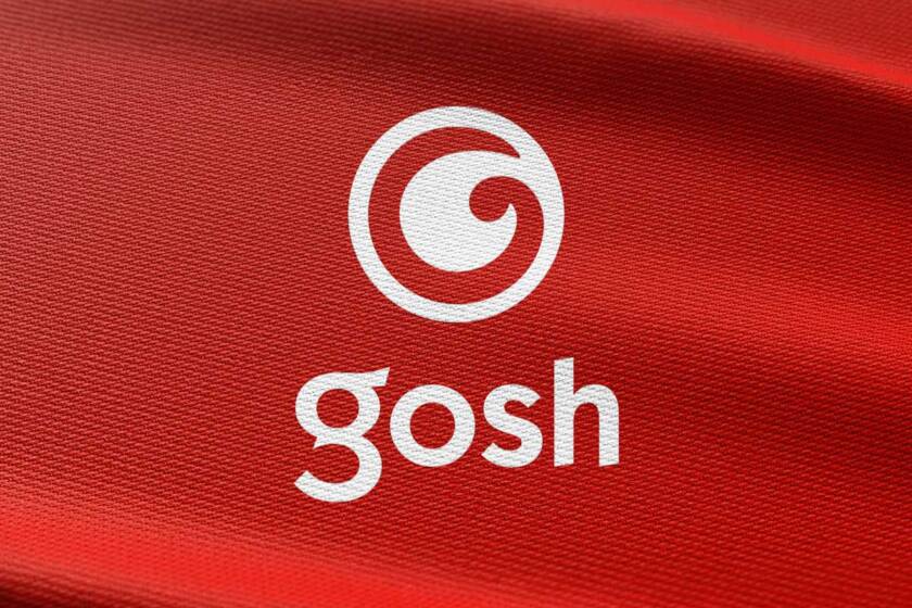
Gosh
The expression “Gosh!” became the logo mark and the name of this company. The design concept comes from the idea of an “eye” and illustrates the state in which the eye is being impressed and surprised by using and transforming the reflection of light displayed on the eye’s surface to symbolize the letter “G” of gosh. Also, this letter can bring the sense of a human touch as it’s not a perfect stroke, and so the entire mark expresses humanity and trust. Finally, the logo type of “gosh” implies activity, youth and energy.
Each of these logos began with a clear idea that guided the form, style and tone. By understanding the essence of a brand, even a small visual element can communicate meaning and create identity with impact.
We would be delighted to explore identity ideas with you if you are considering a new brand direction!


