Designing with purpose by adapting to diverse audiences

At TMCreation, we find that creating a logo for a technology brand is always an interesting challenge. Every company operates within its own field, with its own audience and its own purpose, so the identity must express the right character for that context. Some technology brands need to feel precise and highly engineered. Others need to feel friendly, creative or people focused. No single style suits all of them.
Because of this, our approach always begins with understanding how the brand will be used and who will interact with it. The same technology category can have very different communication needs. A consumer app, a scientific device, an education platform or a cloud service will all demand a different visual tone. Form and colour must respond to the world the brand belongs to.
In some cases, geometry and structured forms can express intelligence and innovation. In other cases, a softer or more expressive style communicates trust, accessibility or community. Technology design is not limited to one visual language. The aim is always to find a style that makes sense for the audience while remaining clear and adaptable.
Another important principle is how the identity behaves across all media. Technology brands often appear on screens, packaging, hardware, marketing material and interface elements. The logo needs to stay recognisable whether displayed very small or at large scale, whether placed on dark or light backgrounds, and whether printed or digital. Simplicity helps, but simplicity alone is not enough. The form must be intentional and able to work in many environments.


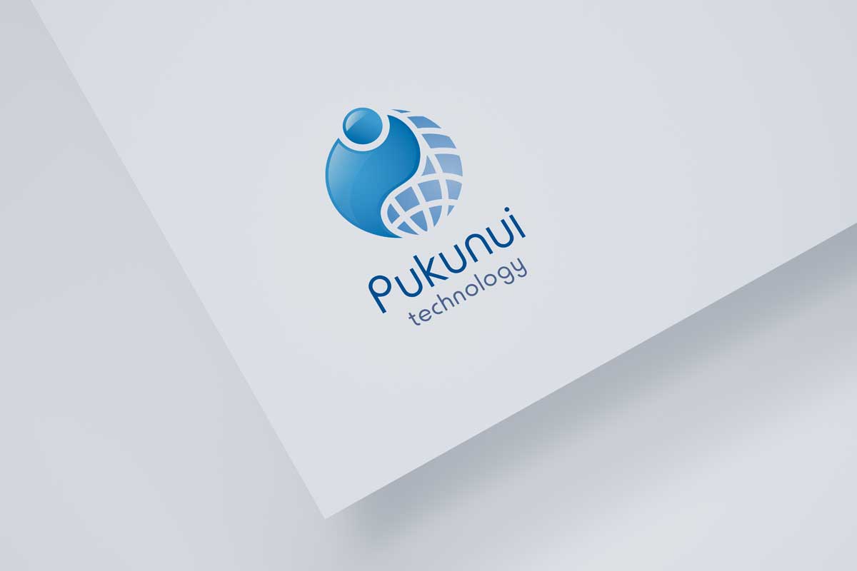
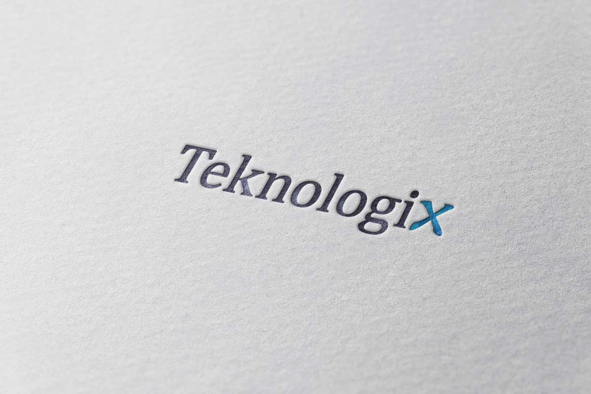
The sample visuals shown here reflect a range of approaches TMCreation has used for different clients. Some identities rely on clean and minimal structure, others on dynamic form or friendly curves. Each direction is shaped by the values and personality of the brand rather than by a fixed formula. The goal is to create a consistent presence that supports the product and communicates purpose without overpowering it.
What matters most in technology branding is balance. Too much detail can feel temporary. Too little intention can feel unfinished. A strong identity sits in the middle, confident and adaptable, with a visual language that can grow with the brand as technology and markets evolve.
Our approach to logo design has been shaped by many years of working across different industries and audiences. Whether the design is minimal, geometric or expressive, the foundation is always the same. A strong logo should communicate clearly, adapt easily and stay relevant over time.
If you would like to explore ideas for your own brand identity, we are always happy to discuss possibilities.

