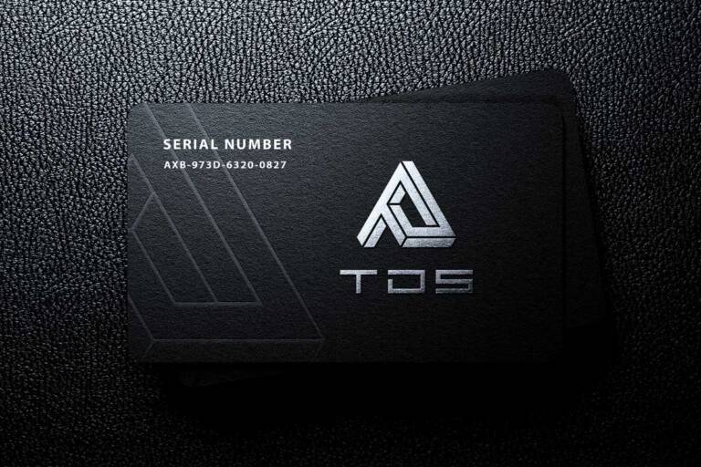
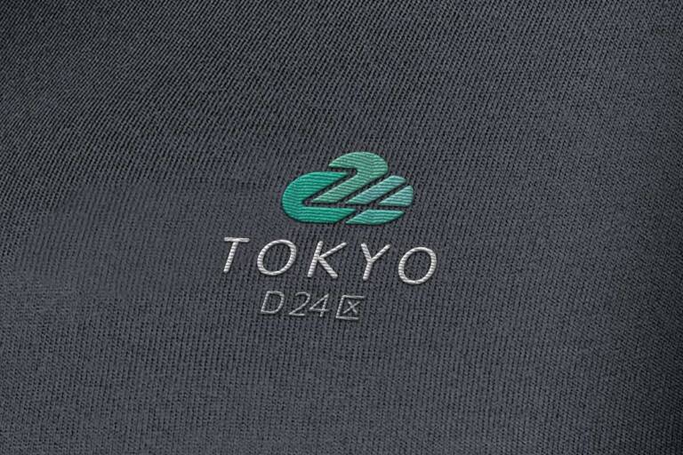
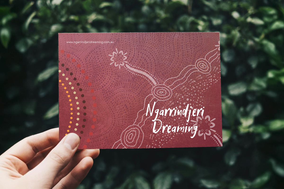
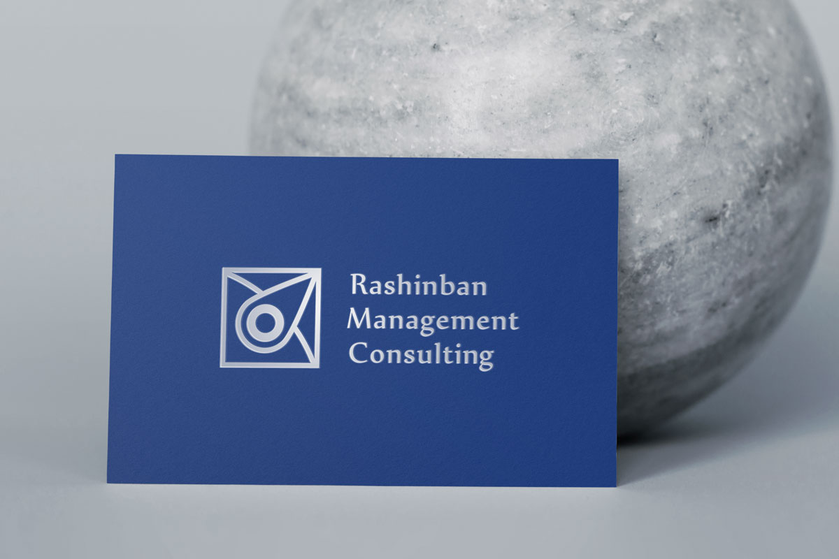
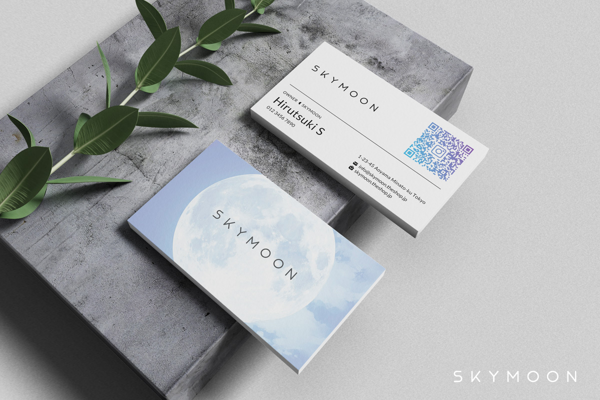
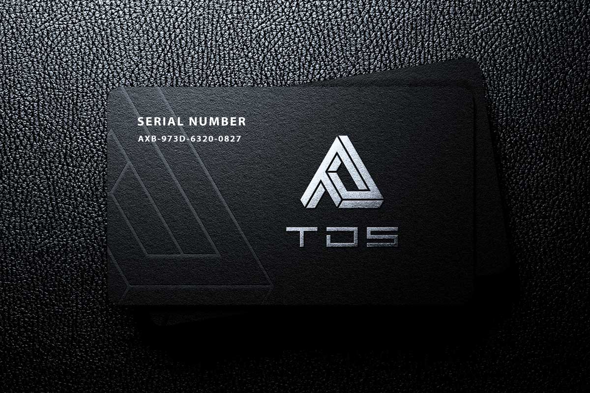
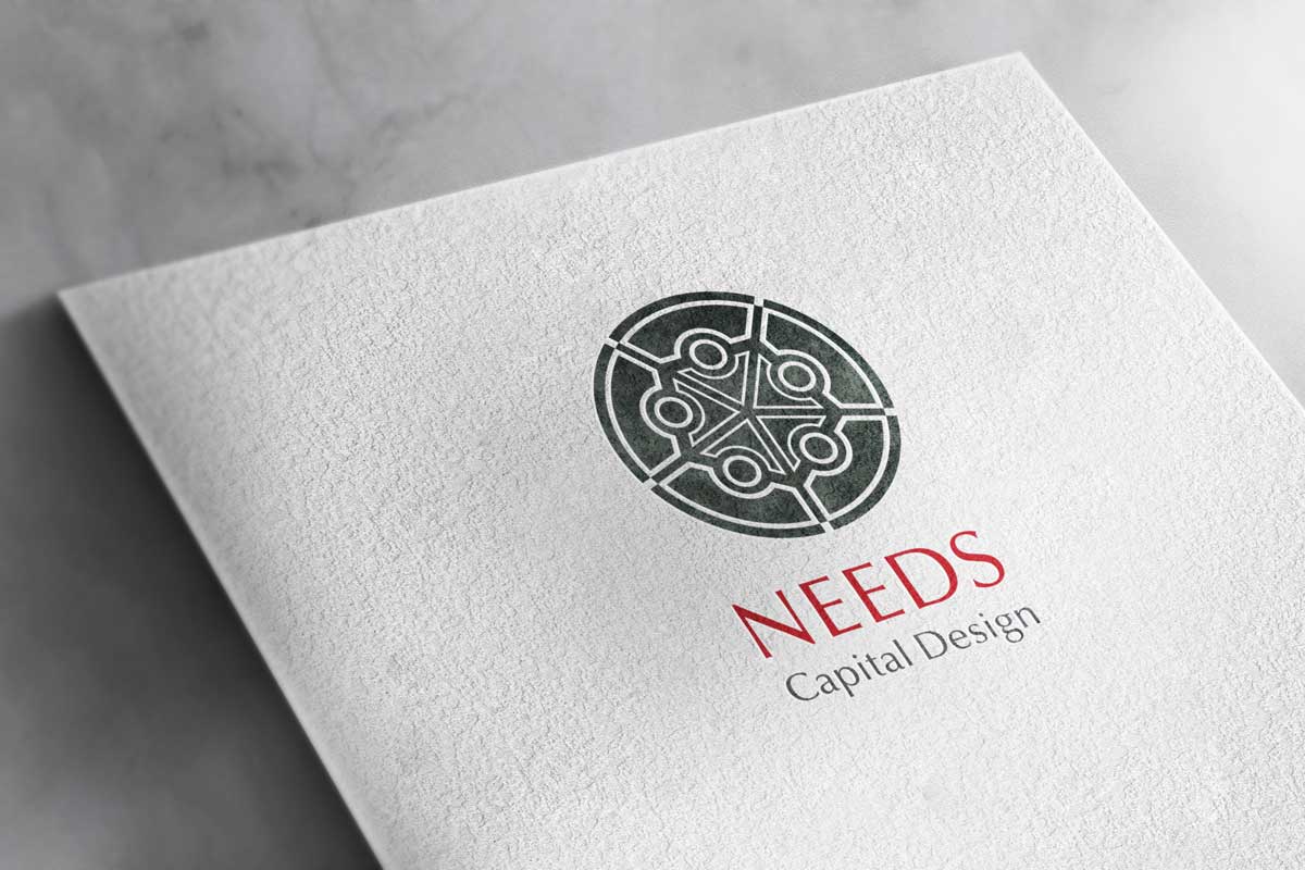
Our business card uses high-quality textured matt lamination with an elaborate UV gloss effect applied on top of the logo mark.
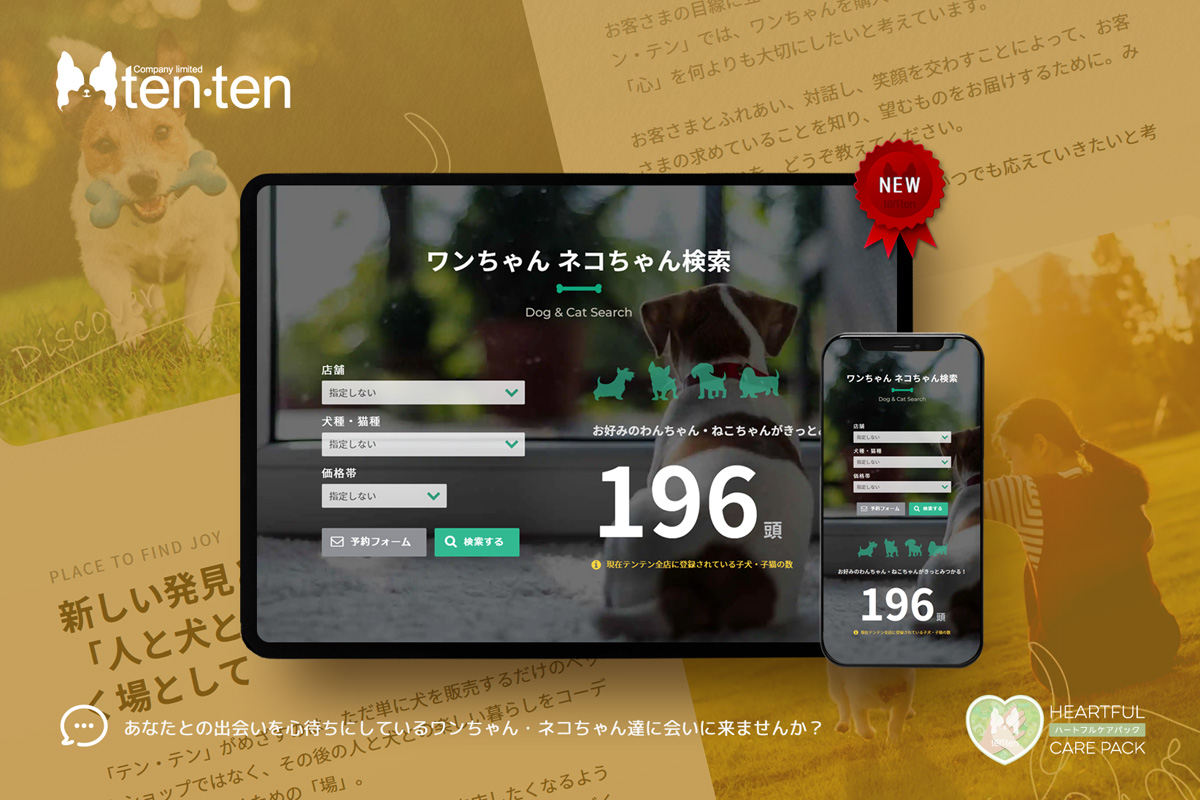
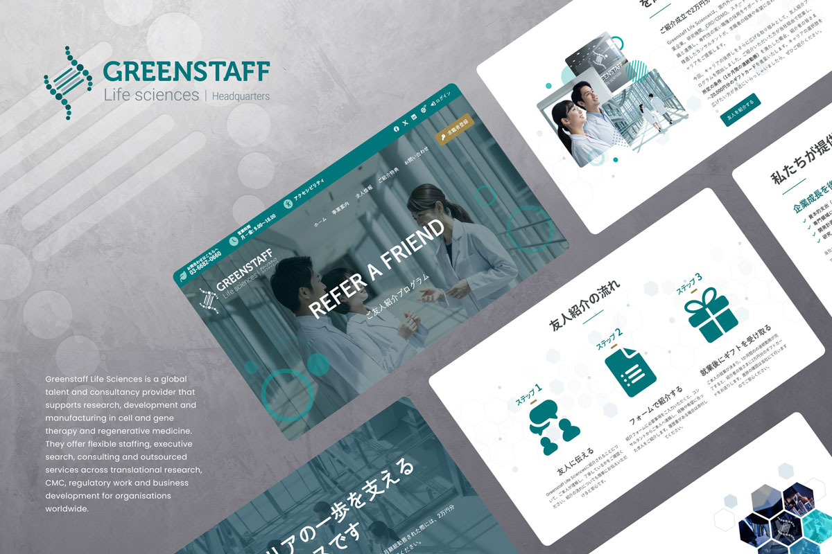
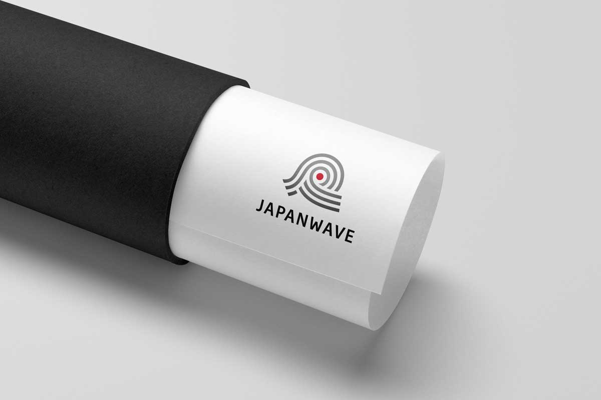
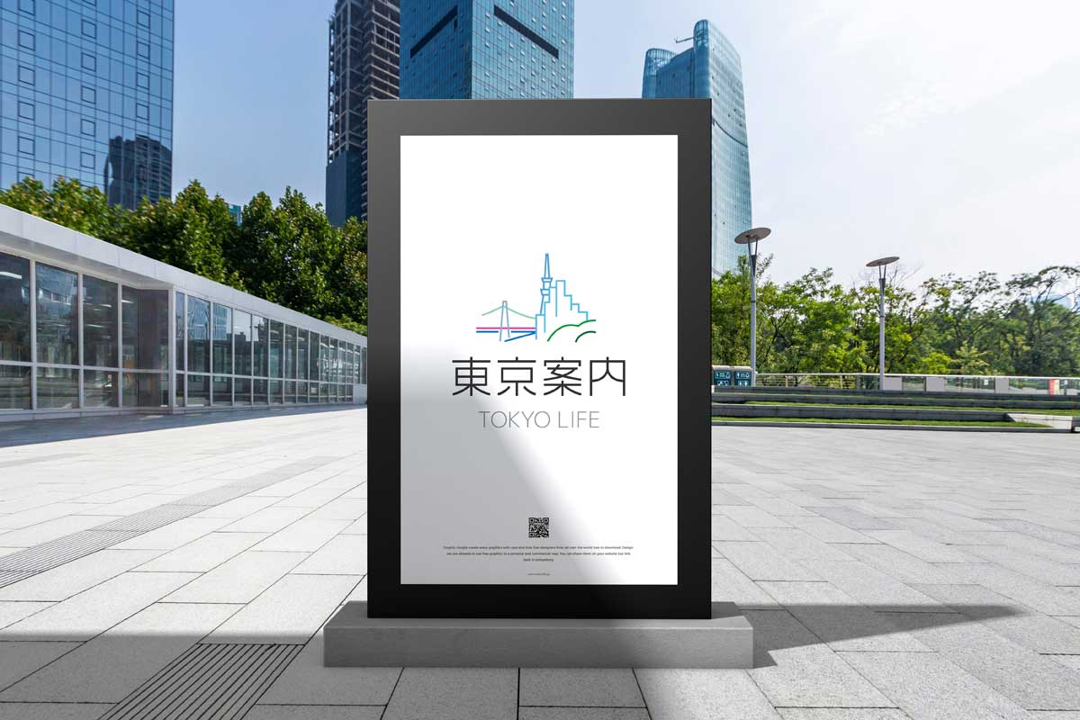
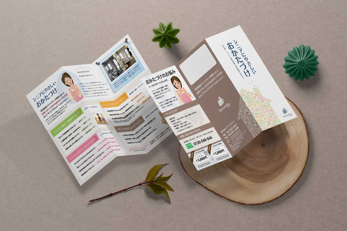
Reach Japanese customers with natural wording and familiar design. Speak with our Japanese team fluent in English.
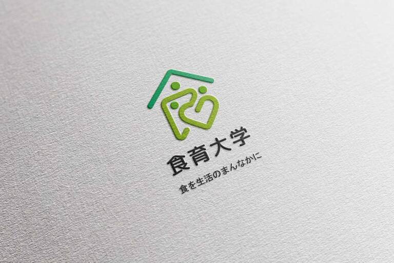
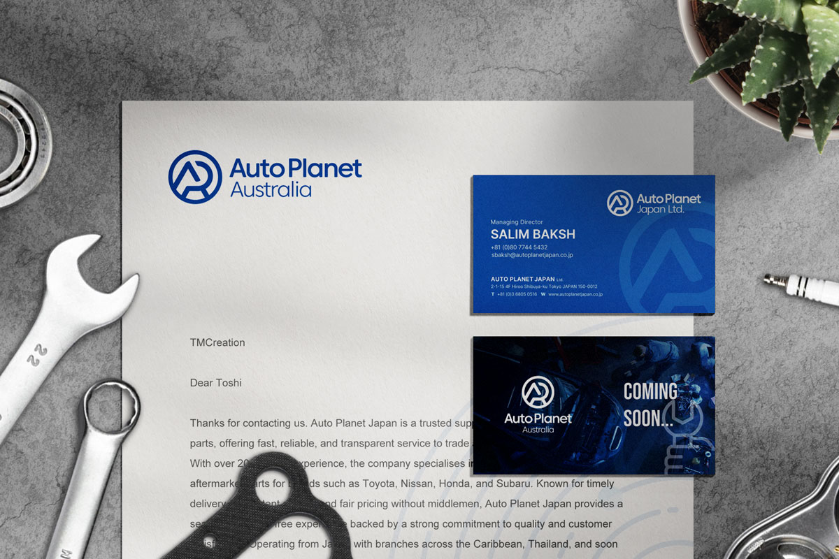
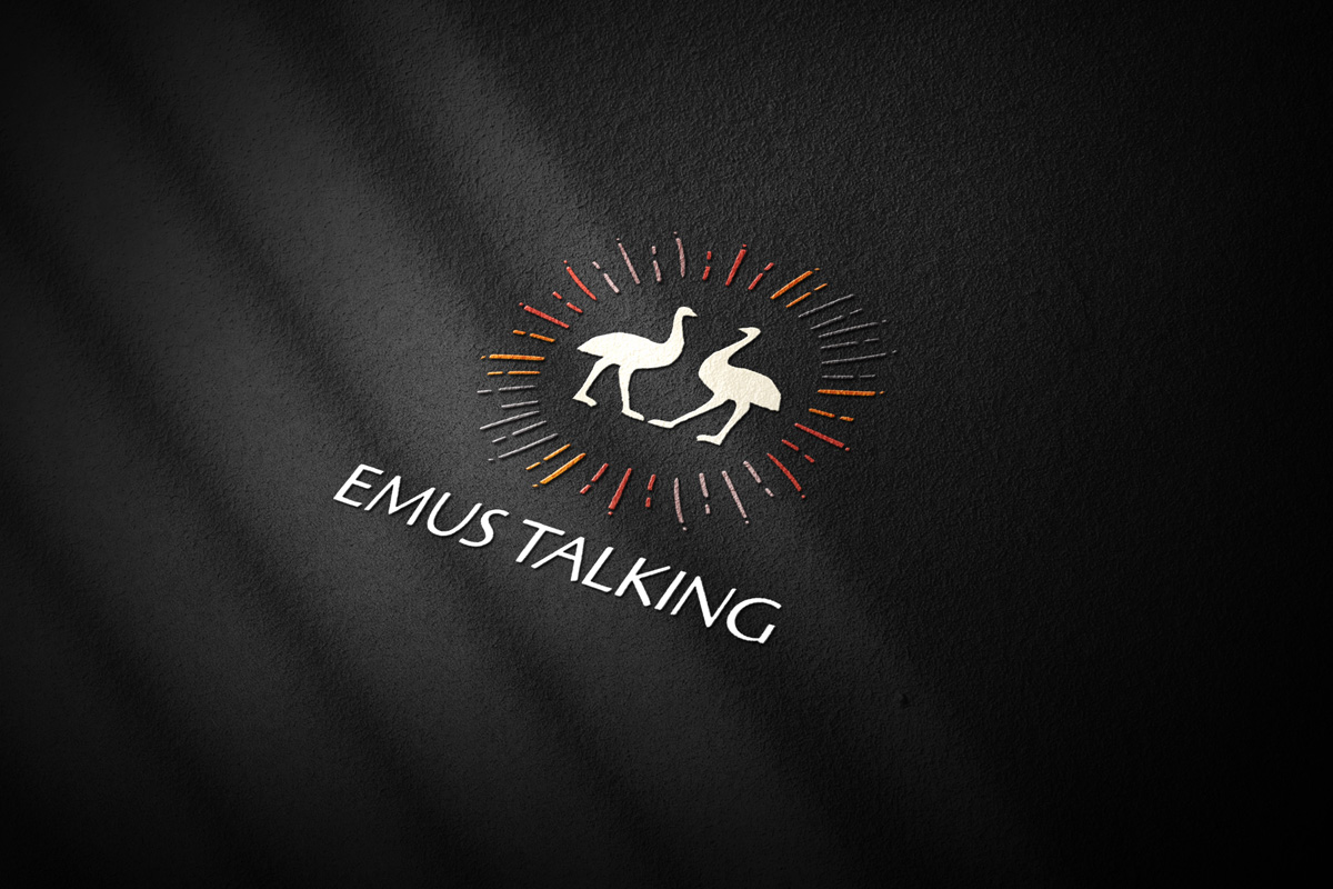
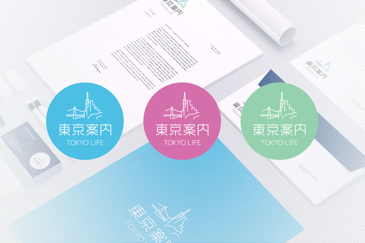
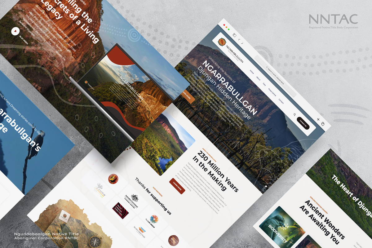
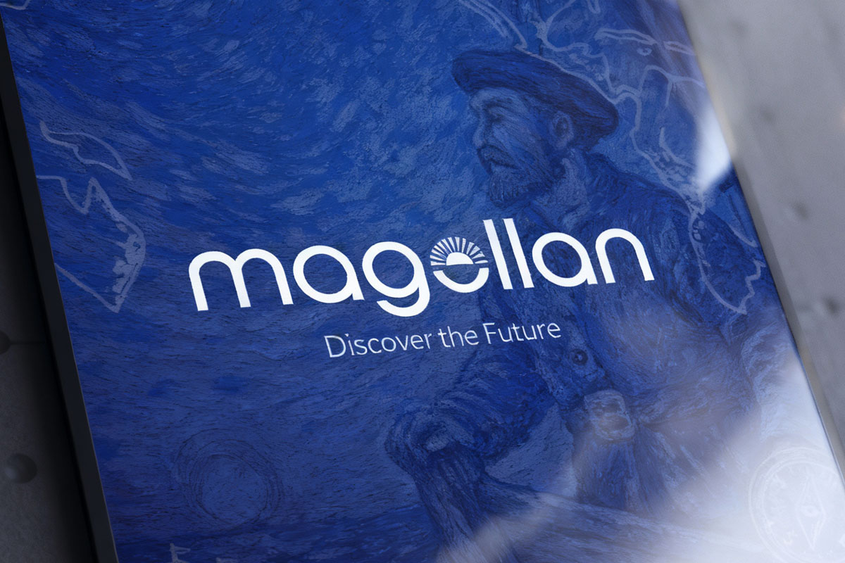
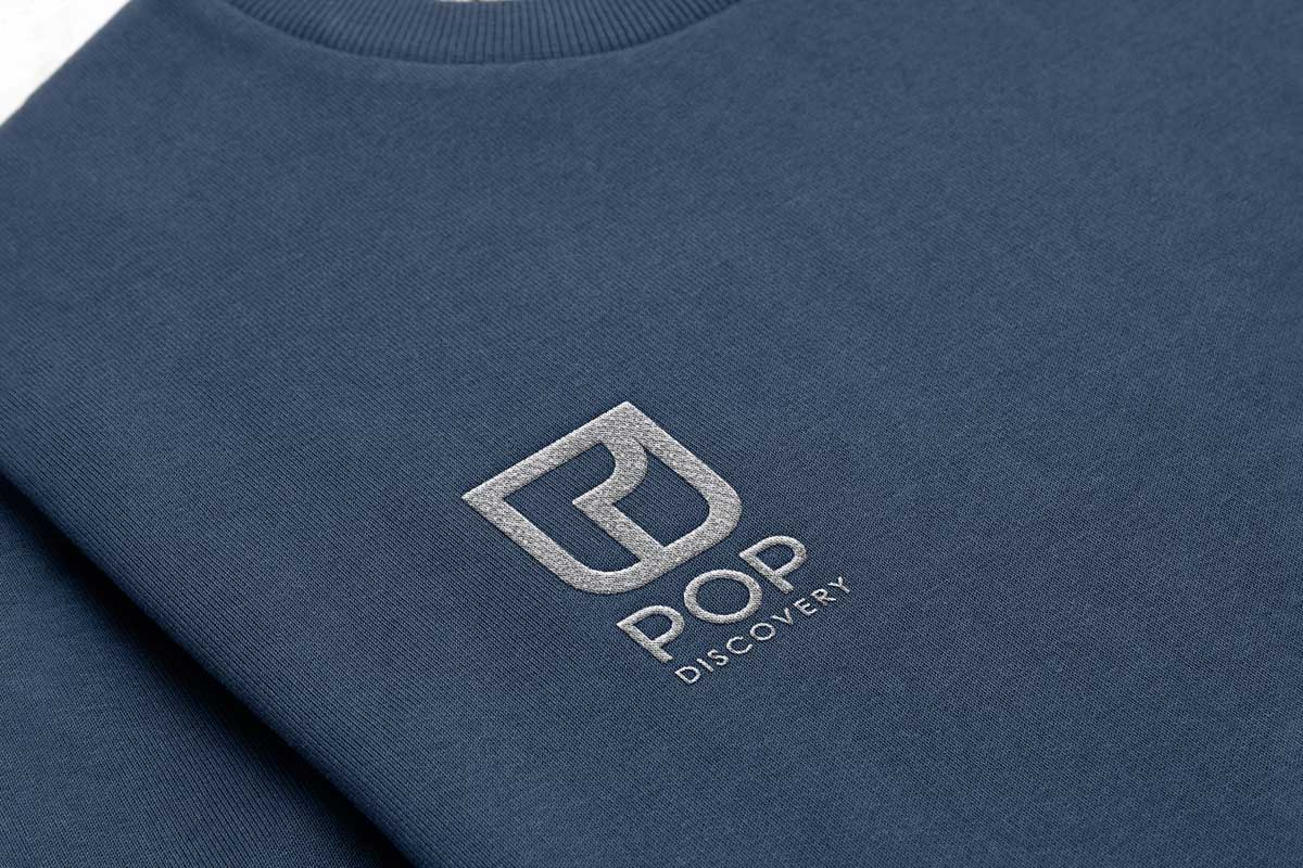
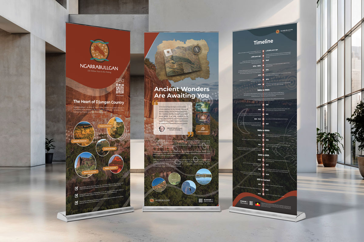
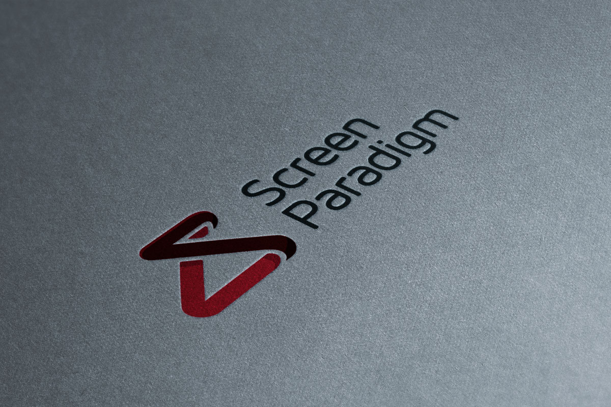
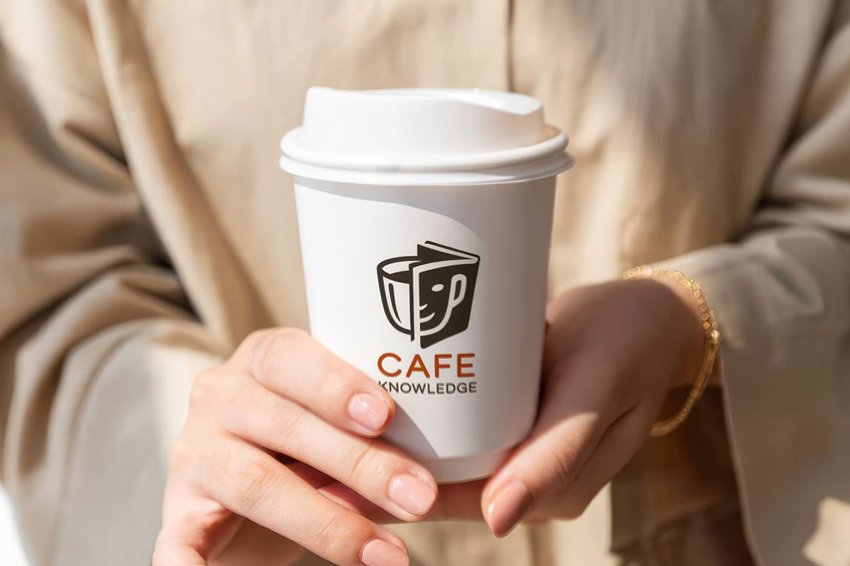
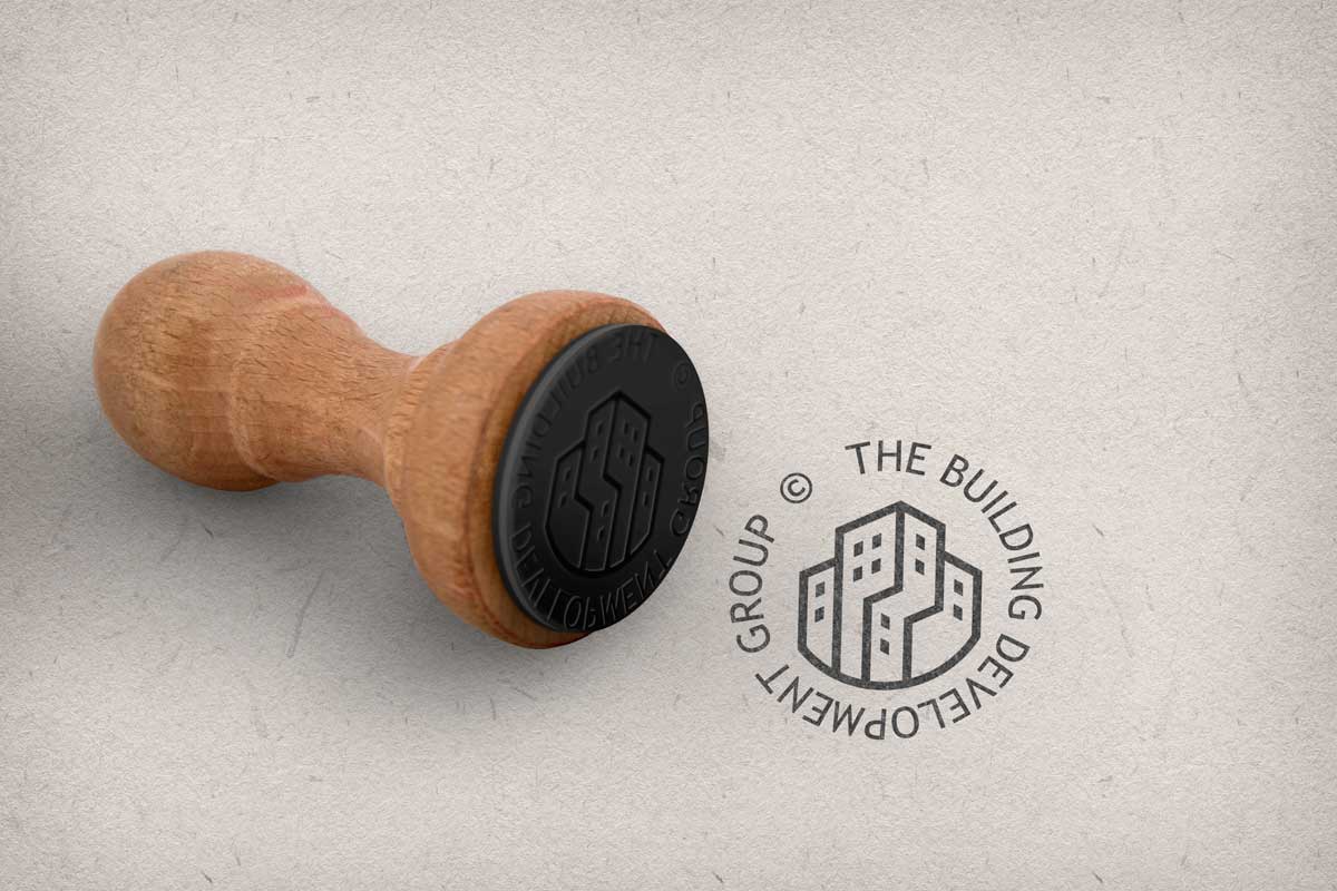
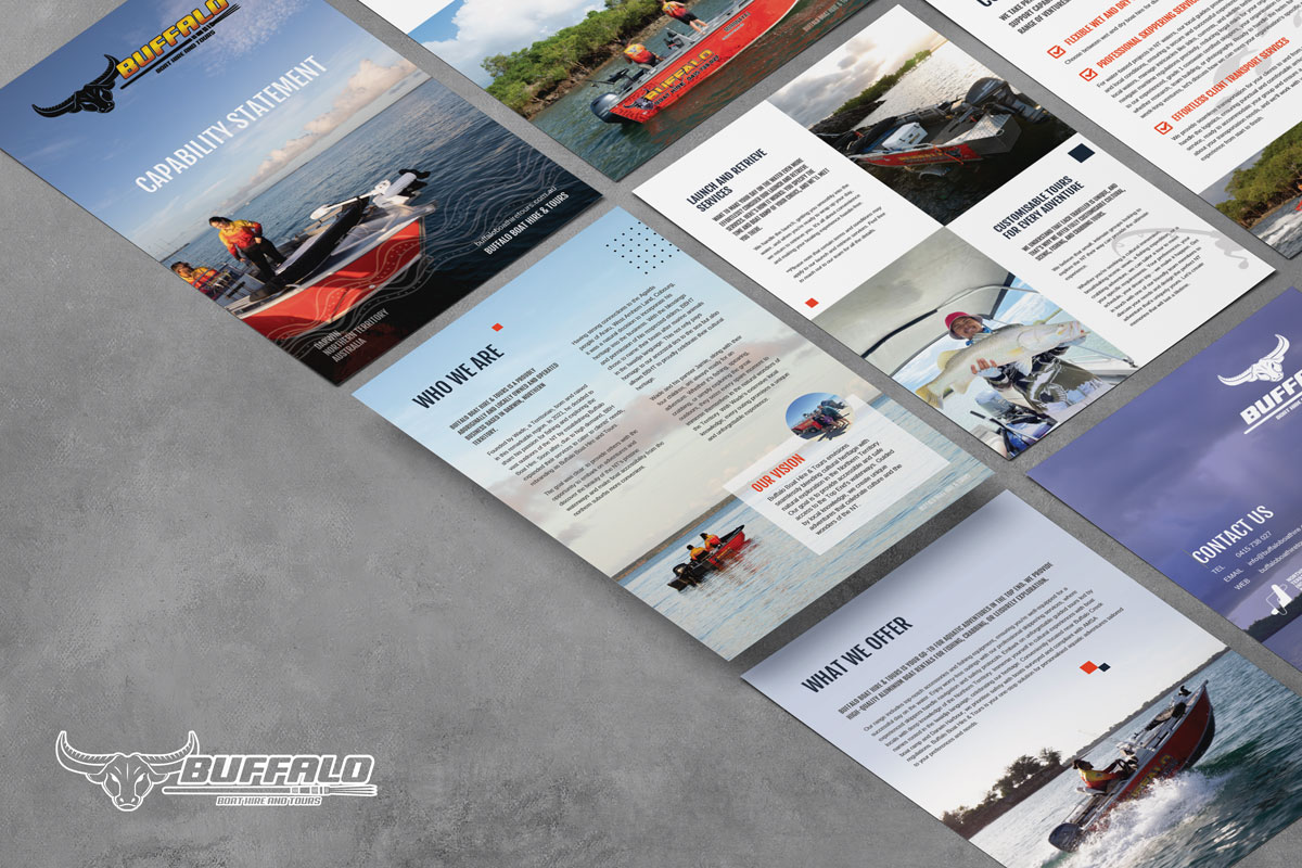
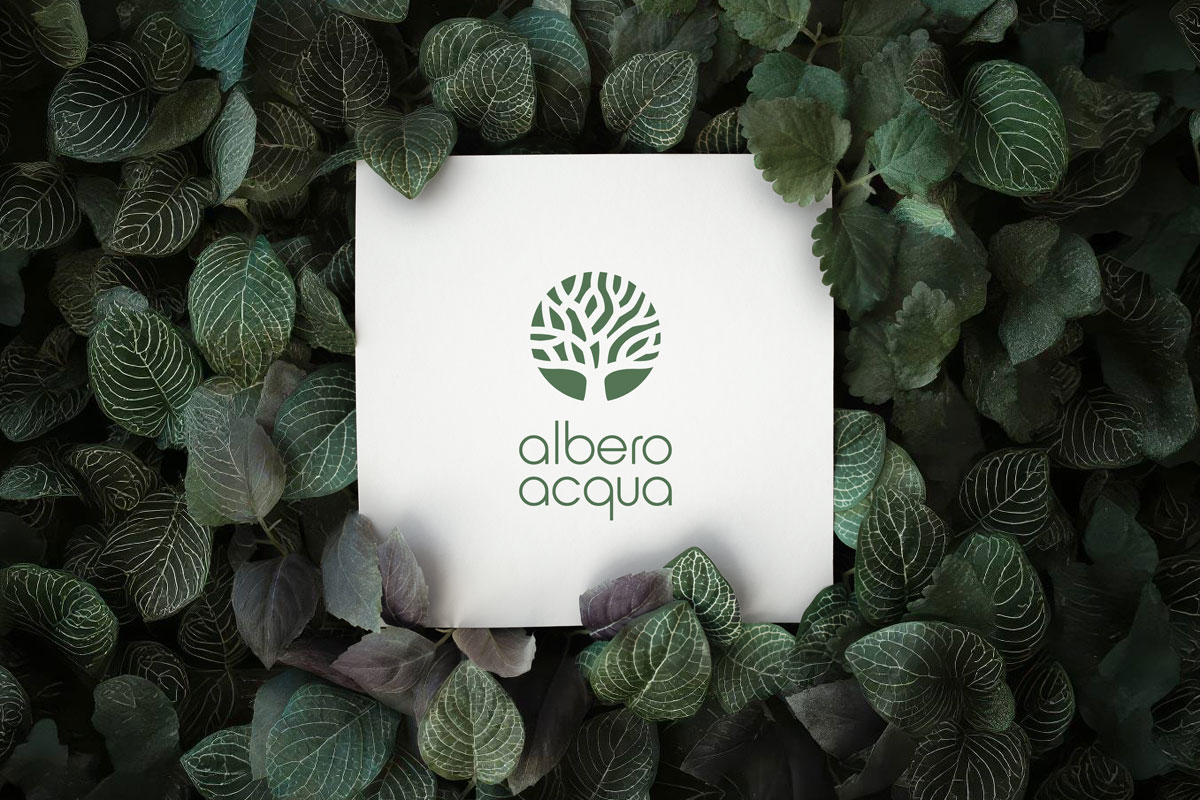
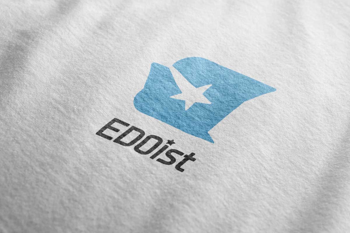
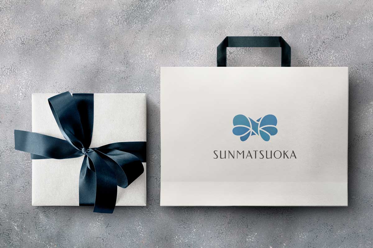
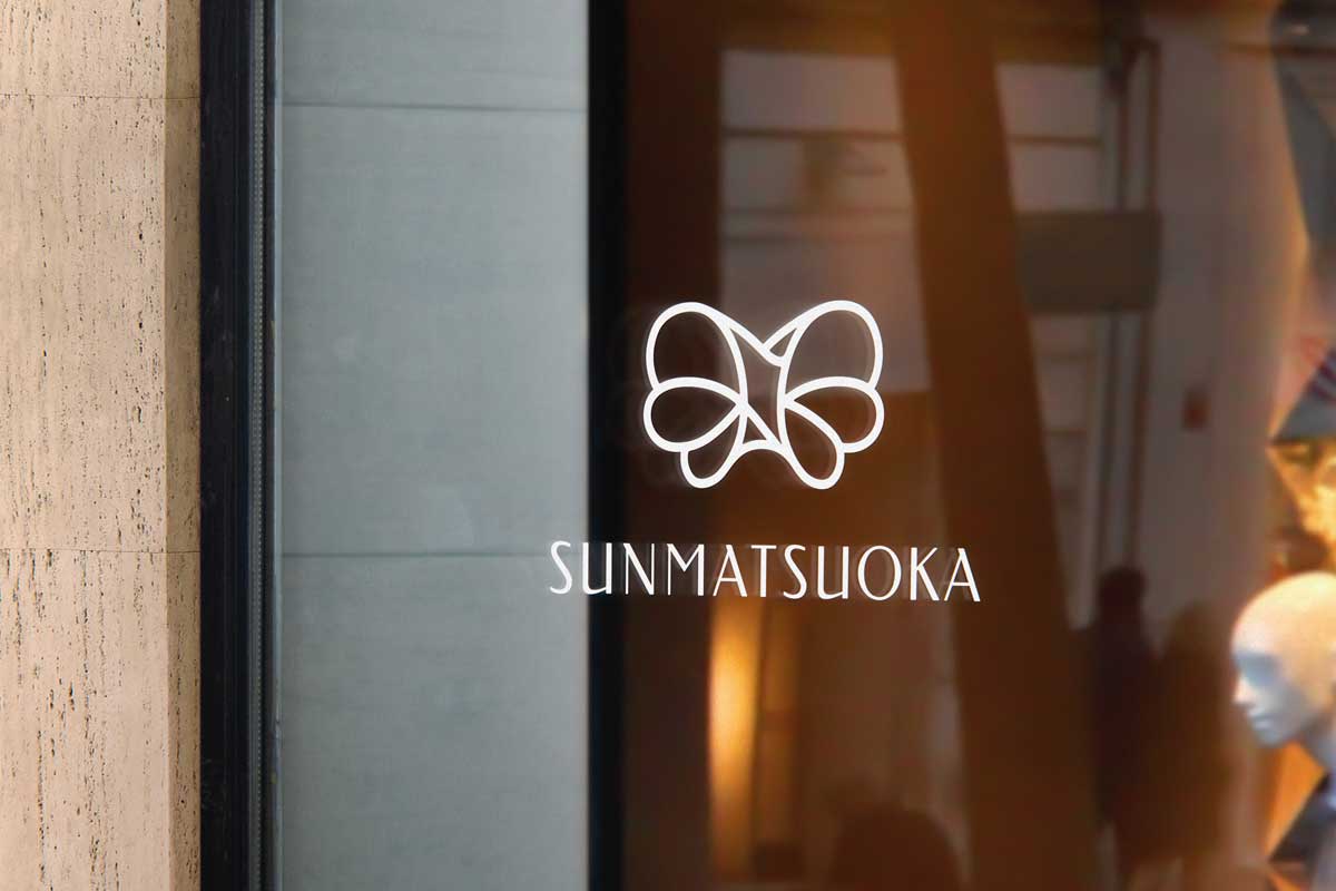
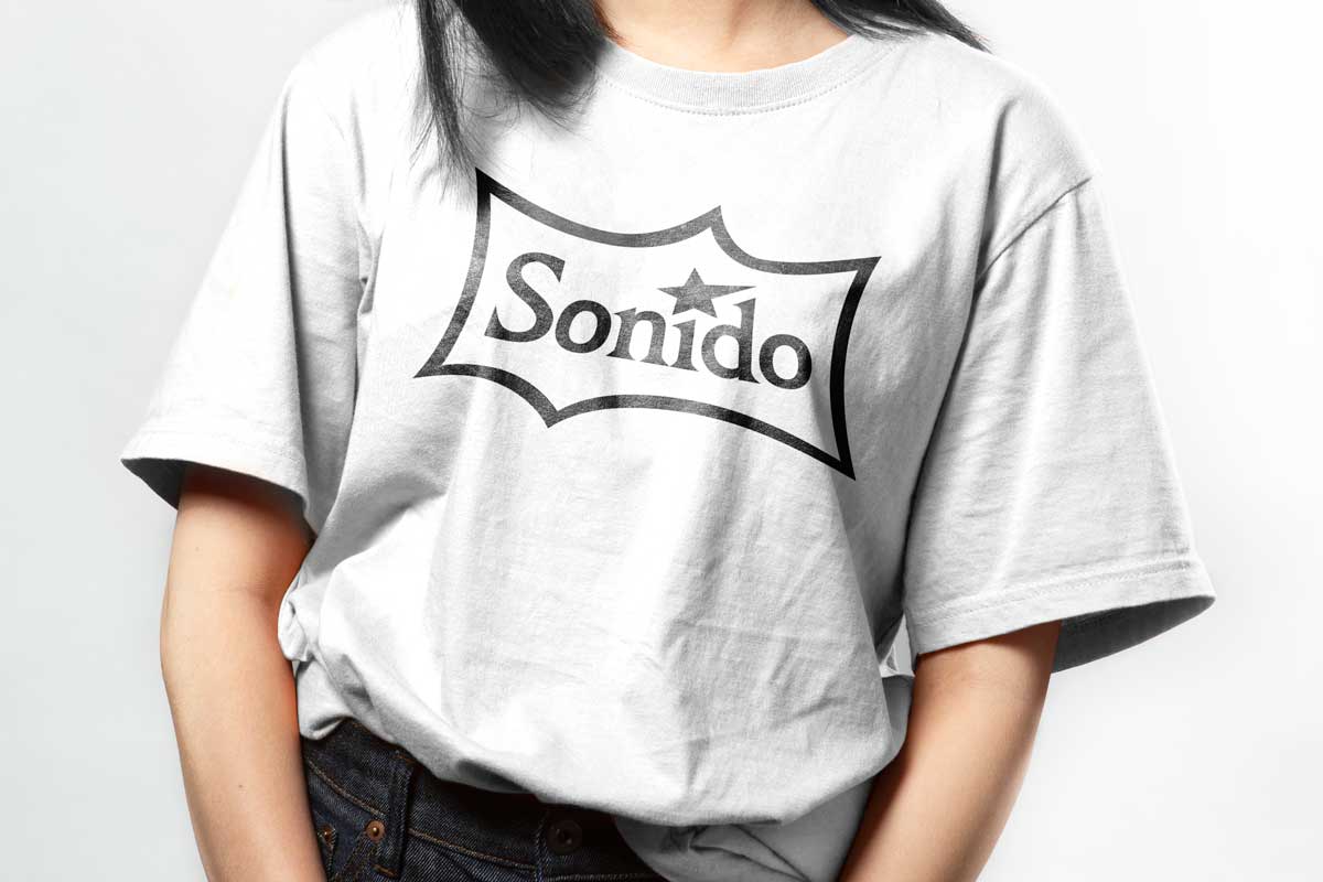
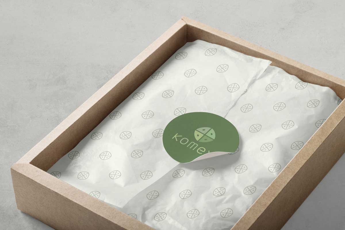
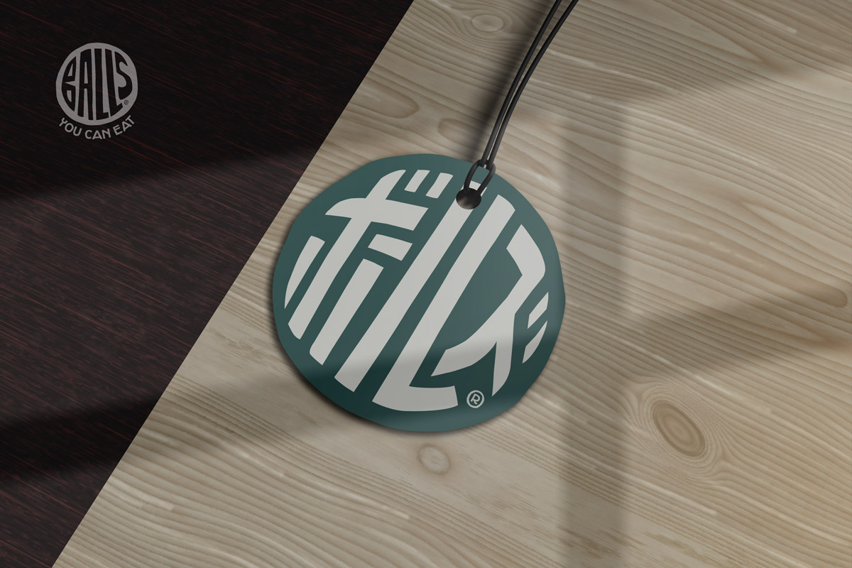
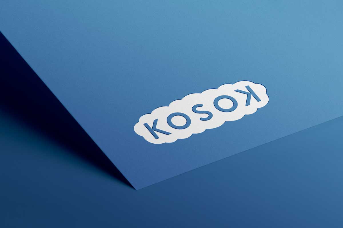
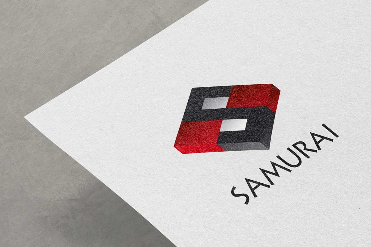
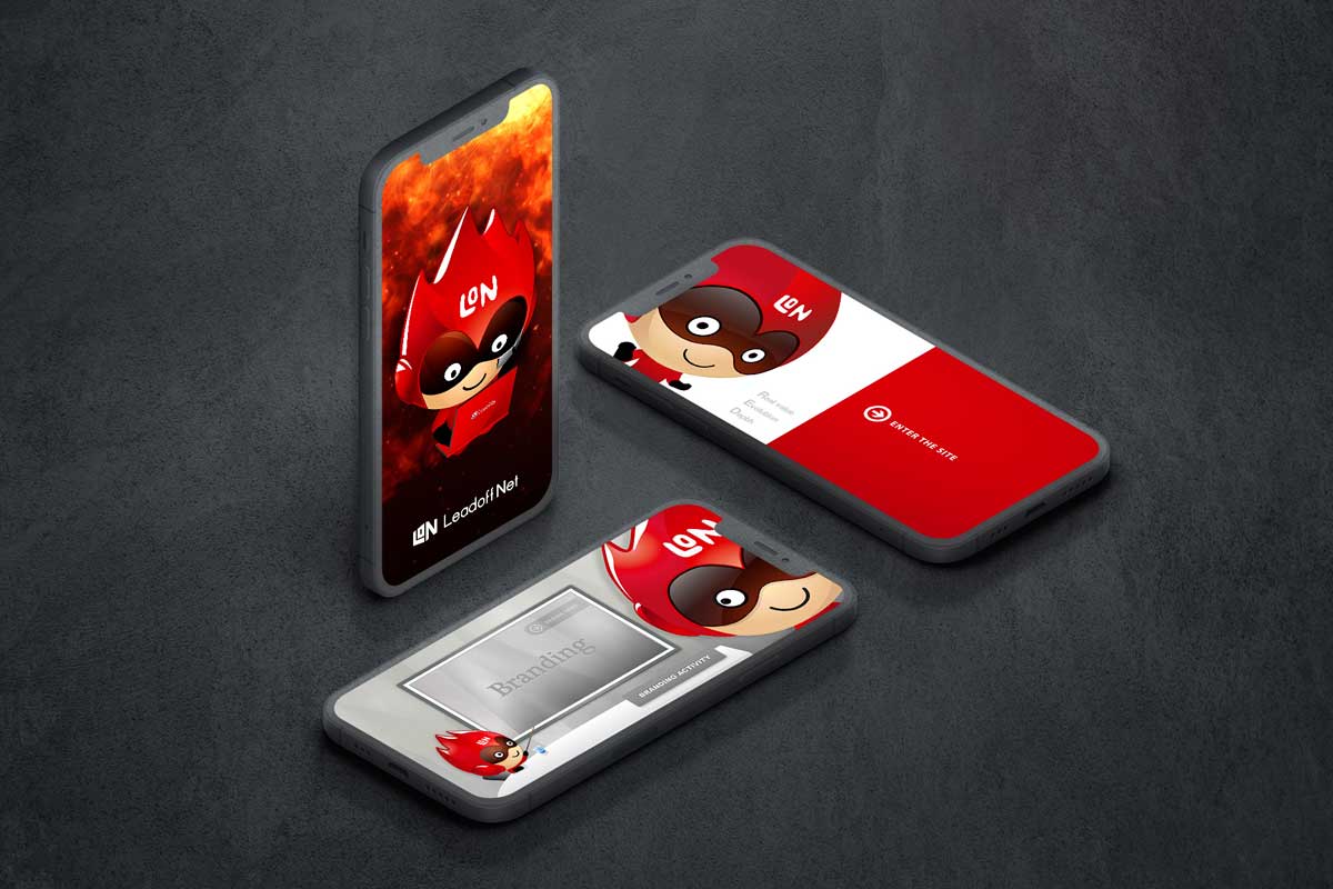
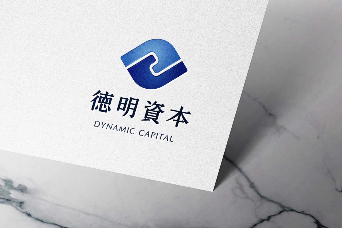
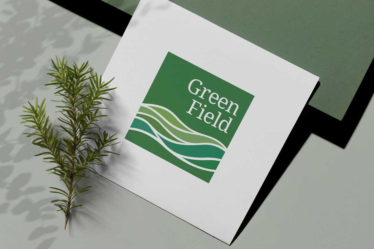
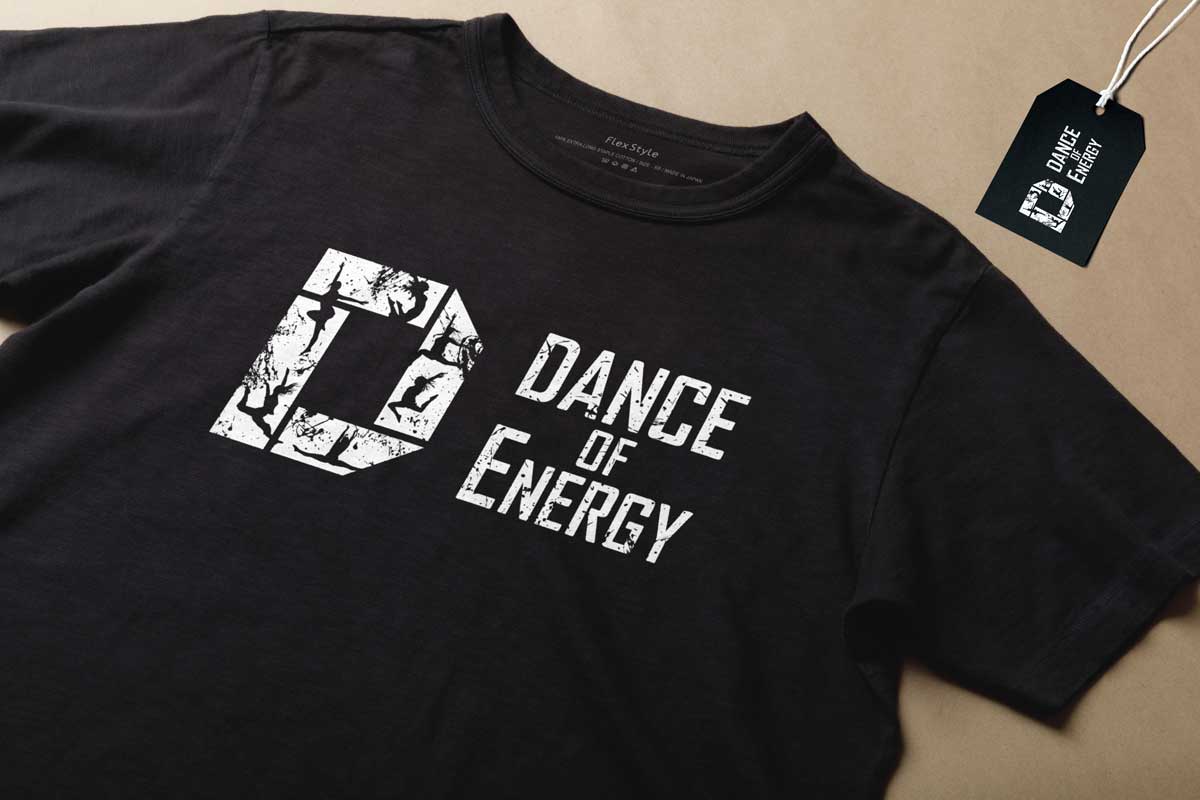
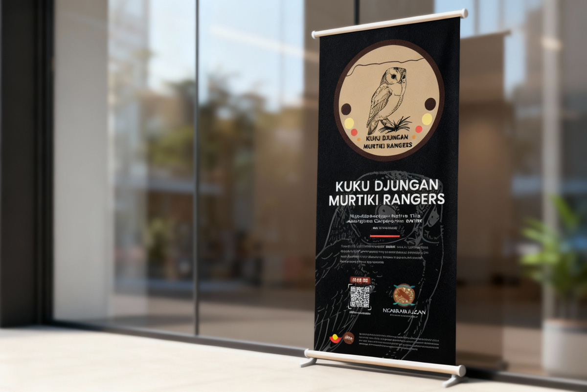
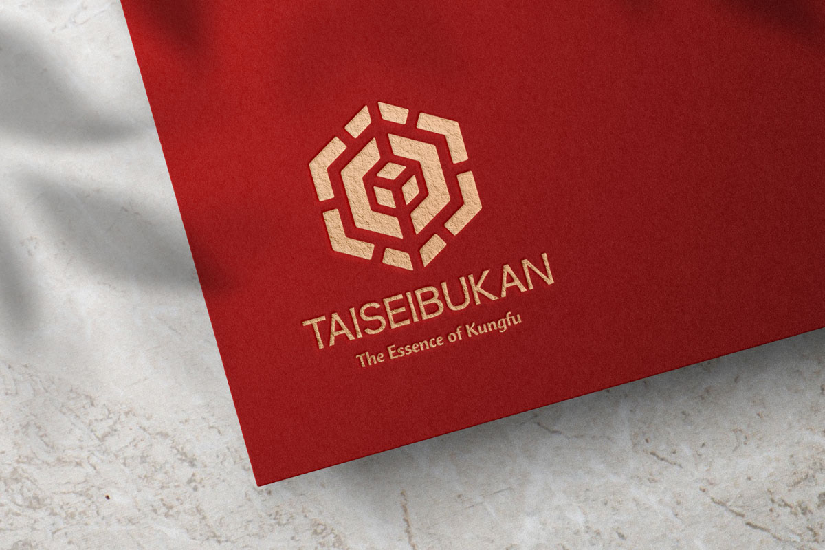
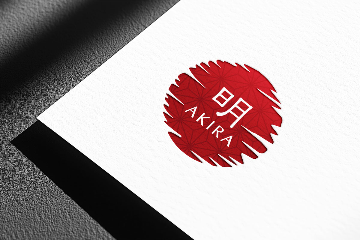
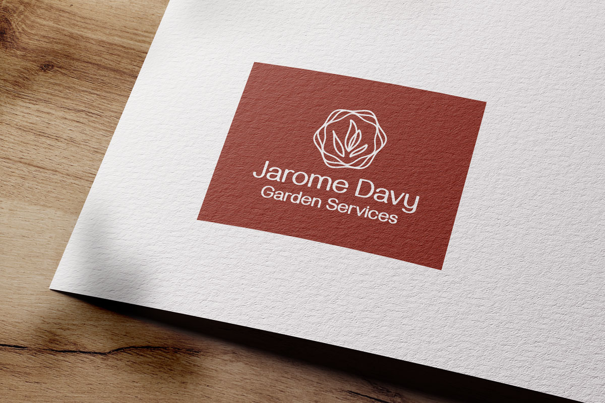
We build strong brand foundations that guide your logo, stationery, messaging, and future website design.
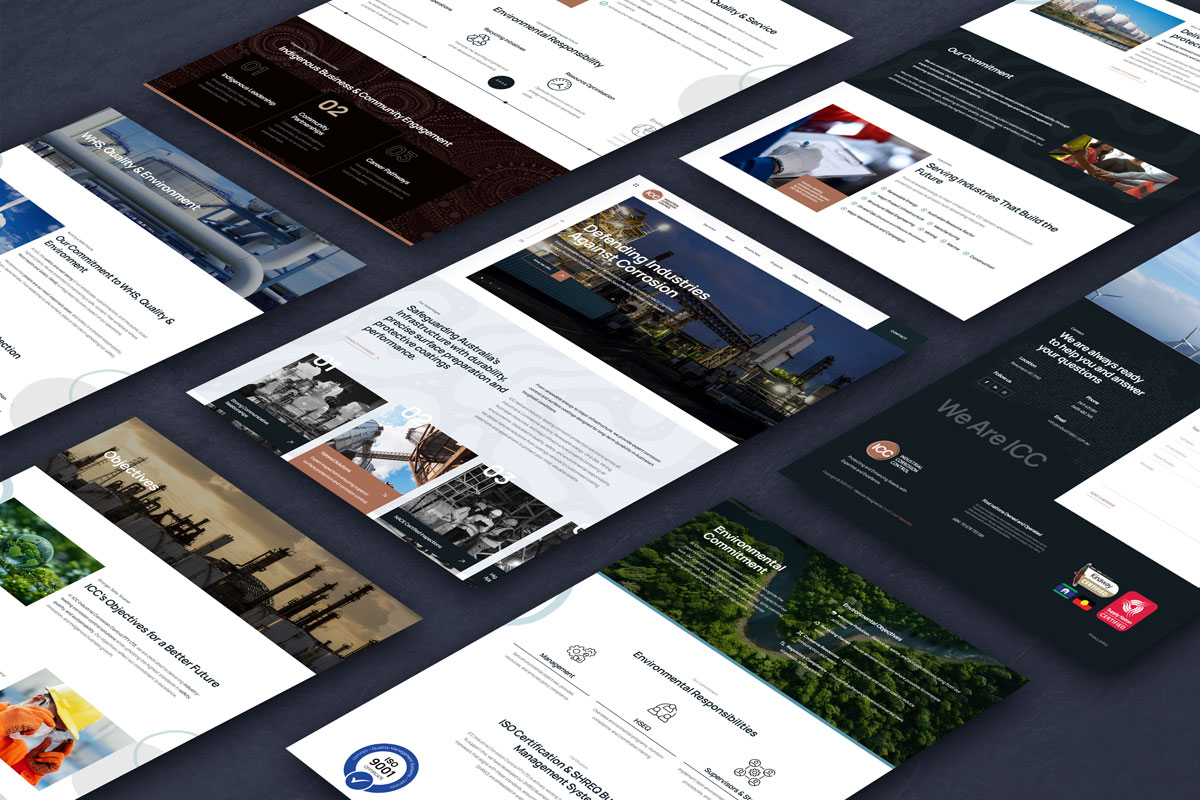
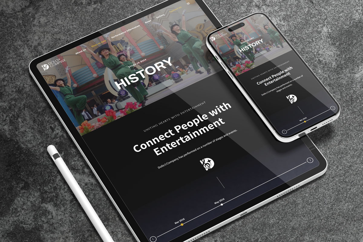
We design modern, high performing websites that match your branding and support long term business growth.
We keep your website secure, updated, and running smoothly with reliable maintenance and ongoing support.


